Ask five centres for their screen specs and you’ll get five different answers. One has portrait screens in the mall and a landscape wall in the food court. Another has a totem out the front that’s printed, not digital at all, and still has to match.
This guide is the cheat sheet we wish we’d had. It lists the sizes we see most often, what their shapes mean for a layout, and the three things that change between them: safe areas, type size and dwell time. It won’t replace your network’s spec sheet, but it should help you read one and know what to ask.
First, a caveat that matters
Every centre’s screen network is different. Screens get installed in different years, by different suppliers, at different heights, behind different glass. Two screens that both say “portrait” can have different resolutions, different bezels and different rules about what the player will accept.
So treat every number below as a starting point, not a spec. Before you build anything, get the spec for each screen you’re booking: the exact pixel size, the file types and size limits, how long each slot runs, and whether anything sits over the content (a clock, a logo bug, a touch menu).
The cheat sheet
These are common examples, not a complete list. The first three are standard broadcast and display resolutions, documented well beyond our industry. The rest are the built-in starting points in Mestra: the “Common shopping-centre sizes” pack that every new organisation starts with, plus its “Social” pack. Your own screens will almost certainly include sizes that aren’t here.
| Format | Size | Shape | Where you’ll meet it |
|---|---|---|---|
| Landscape screen (Full HD) | 1920 × 1080 px | 16:9 | Food court screens, video walls, landscape mall screens |
| Portrait screen (Full HD) | 1080 × 1920 px | 9:16 | Portrait mall screens and digital posters. Mestra’s pack calls it Digital Screen |
| 4K screen | 3840 × 2160 px, or 2160 × 3840 px in portrait | 16:9 or 9:16 | Newer screens. Same shape as Full HD, twice the pixels each way |
| Digital Directory | 1080 × 1510 px | About 5:7 | For example, a tall portrait panel, such as on a directory kiosk |
| Digital Banner | 1920 × 930 px | About 2:1 | For example, a wide landscape in-centre screen |
| WiFi Portal | 3360 × 2240 px | 3:2 | The page shoppers see when they join the centre’s WiFi |
| EDM Footer | 1080 × 500 px | About 2.2:1 | The banner at the foot of an email |
| Totem Board | 500 × 1700 mm, 150 DPI, 5 mm bleed | About 1:3.4 | A tall printed totem, often next to a screen |
| Instagram Story | 1080 × 1920 px | 9:16 | Social, same shape as a portrait screen |
| Instagram Post | 1080 × 1080 px | 1:1 | Social |
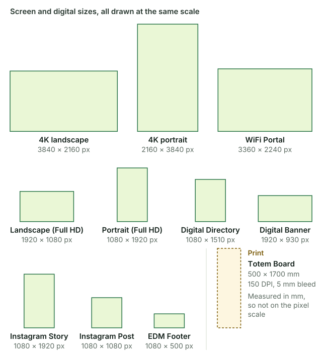
Figure 1. Every size in the table, side by side. The screen and digital sizes share one scale. The print totem is drawn to its own.
A few things jump out once the sizes sit side by side.
Portrait and landscape aren’t mirror images. 1080 × 1920 and 1920 × 1080 have the same pixels, but a layout can’t just rotate. A landscape layout puts the headline beside the image. A portrait one stacks them. Everything gets re-planned, not turned.
Some shapes are awkward on purpose. A 2:1 banner and a 1:3.4 totem sit at opposite ends. On the banner, a headline that took three lines on a poster needs to fit on one or two. On the totem, the same headline might break into four short lines, and the logo moves to the top or the foot.
4K is the same shape as Full HD. A 3840 × 2160 screen is exactly twice 1920 × 1080 in each direction, so the layout is the same. What changes is how sharp your images need to be. A photo that looks fine at Full HD can look soft when it’s stretched across a 4K panel.
LED screens break the pattern. Large LED screens are built from panels, and their resolution comes from how many panels there are. You’ll see sizes that match no standard at all. That’s normal. It’s why no list of sizes, ours included, can be the whole story.
What changes between sizes
Safe areas
A safe margin is the part of the frame where nothing important should sit. Everything inside it is the safe area. On screens it exists for a few reasons:
- Bezels and frames. A screen in a case or behind a surround may hide the outer edge of the picture.
- Video walls. Where several screens are tiled, the joins (mullions) cut through the picture. Text across a join is hard to read.
- Overlays. Some networks put a clock, a centre logo or a touch menu over part of the content. Directory screens are the usual suspects.
There’s no single safe margin that works everywhere, so ask whether anything covers the content, and where.
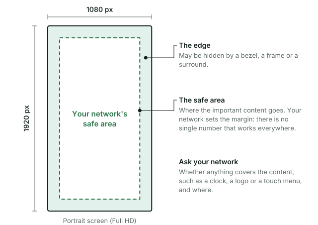
Figure 2. A portrait screen and its safe area. The size of the margin comes from your network’s spec.
In Mestra, each format has a Safe margin and a Bleed, set in the format’s own unit (px, pt or mm). The format editor draws the page with both, so you can see what’s protected before you run anything.
Type size
Type size on a screen depends on how far away people are, how big the screen is and how sharp it is. A screen beside an escalator is a different job from a wall above a food court.
That’s why we don’t give a universal minimum here. A better habit:
- Find out the screen’s physical size and roughly where people stand when they see it.
- Mock up your smallest text at the real size and look at it from that distance.
- Write the result down as a rule for that format, so the next campaign doesn’t start from scratch.
Mestra stores that rule on the format, as a Minimum type size for each role (headline, body, legal and so on), in points. Each format carries its own, because a directory slot and a food court wall shouldn’t share one.
Dwell time
Dwell time is how long someone actually looks. It’s shaped by where the screen is: people walking past a corridor screen give it a moment, people queueing for coffee give it longer, and people standing at a directory are looking for a shop, not your ad.
Two things follow:
- Fewer words for faster spots. If a screen is mostly seen in passing, the message needs to land in a glance: one idea, one headline, the offer and the brand.
- Loops and slots matter. Most screens play your artwork as one slot in a loop. Ask how long your slot runs and how long the loop is, because that’s how long your message waits to come round again.
Dwell time is harder to measure than slot length, so stand near the screen for ten minutes and watch.
A quick checklist before you build
- Get the spec for every screen you’re booking, not just one per type.
- Note the exact pixel size, file types, file size limits and slot length.
- Ask what covers the content, if anything, and where the safe area is.
- Check whether any format is print (mm, DPI and bleed) rather than screen.
- Set a minimum type size for each format, based on how it’s really seen.
Where Mestra fits
We built Mestra for this spread of sizes, odd ones included. You design one master in InDesign, Figma or Canva, and Mestra builds each format from that master’s own elements, in your design app, as editable artwork.
The built-in packs are only a starting point. If a screen in your centre is an unusual size, or an LED wall is a width nobody else has, you add it as a format of your own in Setup > Formats > New format, in px, pt or mm (a mm format also needs a DPI). Every size still follows your master’s design: the same elements, laid out again for the new shape.
Each format, built-in or your own, keeps its own safe margin, bleed and minimum type size. You still need your network’s spec, but once a format is set up, it stays set up.
Sources and notes
- 1920 × 1080 (Full HD) is the picture format in ITU-R Recommendation BT.709. 3840 × 2160 (UHD, often sold as 4K) is defined in ITU-R BT.2020.
- The Mestra sizes are from the built-in “Common shopping-centre sizes” and “Social” packs. Adding your own formats, and the format fields (Safe margin, Bleed, Minimum type size), are covered in Masters, formats and runs and the Quickstart.
- Ratios are rounded. 1920 × 930 is about 2.06:1, 1080 × 1510 is about 0.72:1 and 1080 × 500 is 2.16:1.
- Social platform sizes change from time to time. Check each platform’s current guidance before a campaign.