A screen in a shopping centre is a tough place for a message. People are walking, carrying bags or herding kids. Your artwork gets a few seconds, sometimes less, often from further away than you’d think, under lighting you didn’t choose.
This checklist is for anyone sending artwork to a centre’s digital out-of-home (DOOH) screens. It’s tool-neutral. Where Mestra can carry part of the load, we say so, and where it can’t, we say that too.
One rule sits above all the others: your network’s spec wins. Every centre’s screens differ in size, brightness, position and what the player accepts. If anything here disagrees with the spec you’ve been given, follow the spec.
1. Contrast
Text has to stand out from what’s behind it, and a screen in a bright atrium, under skylights or behind glass, loses contrast you had on your monitor.
- Put text on a calm area of the image, or on a solid panel.
- Be wary of thin type over photos, and of mid-grey on mid-tone backgrounds.
- Check your text and background colours with a contrast checker. The web’s accessibility guidelines (WCAG) ask for a contrast ratio of at least 4.5:1 for normal text and 3:1 for large text. That’s guidance written for web pages, not screens in a mall, but it’s a sensible floor. On a bright screen seen from a distance, aim higher.
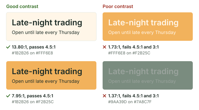
Figure 1. The same text in four colour pairs, each with its WCAG contrast ratio. The poor pairs fail even the 3:1 floor for large text.
Mestra keeps CTA buttons readable: it picks the button’s fill and text colours from the brand palette and corrects them to meet WCAG AA contrast (4.5:1). But it doesn’t check the contrast of other text today, such as a headline or legal line over a photo, and no review flag covers contrast. That part is yours. Mestra also uses whichever of a brand’s two logos stands out more on the artwork.
2. Minimum type size
Small text that looks fine on your laptop can vanish across the walkway. There’s no single safe minimum: it depends on the screen’s size, its sharpness and the distance.
- Ask the network for each screen’s physical size and resolution.
- Work out the smallest text you can read comfortably at the real distance, ideally by testing on the screen itself.
- Write that minimum down for each format and stick to it, including for the CTA and the legal line.
This is where Mestra helps the most. Each format has its own Minimum type size, set in points for each role (headline, body, CTA, legal and so on). When Mestra lays out that format, it can shrink text down to its role’s minimum and never below it. If the text still won’t fit, the format gets a flag (“Some text is still too big at its smallest size”) rather than quietly going smaller. Copy that runs over its line limit gets a flag of its own. In the design apps, the visual review can also note “Text too small to read”.
3. Reading distance
Reading distance is how far away your audience actually is. It drives type size, and it’s the one most often guessed.
- Stand where shoppers stand. The escalator, the food court table, the far side of the walkway.
- Look at the screen from there and note how much of it you can read.
- Sign makers publish legibility charts that link letter height to viewing distance. They’re a starting point, but they vary and were made for signs, not backlit screens. Test before you trust one.
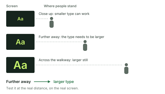
Figure 2. Further away means larger type. How much larger depends on the screen, so test it there.
4. Dwell time
Dwell time is how long people actually look. A corridor screen gets a glance; a screen beside a queue gets longer.
- One message per screen. If you need to say three things, you probably need three slots.
- Ask for the slot length and the loop length. Your artwork shows for one, then waits for the other.
5. Motion
Motion catches the eye, which is the point and also the risk.
- Keep movement purposeful, and make sure the key message reads in a still frame.
- Avoid rapid flashing. WCAG’s rule for web content is no more than three flashes in any one second, to reduce the risk of seizures. It’s a good rule anywhere.
Road-facing screens are a different world. Most in-centre screens don’t face a road. If yours does, state rules usually apply, and they’re much stricter: they commonly ban animation and video outright, and set a minimum time each static image must stay up.
The usual example is the NSW Transport Corridor Outdoor Advertising and Signage Guidelines (Department of Planning and Environment, November 2017). For digital signs it says each advertisement “must be displayed in a completely static manner, without any motion” for its approved dwell time. Static displays must not “contain or imply motion such as vertical or horizontal scrolling, fade, dissolve or animation”, and animated, video or flashing displays that face the road and are visible to road users are prohibited. The minimum dwell time is 10 seconds where the speed limit is below 80 km/h, and 25 seconds at 80 km/h and over.
Other states have their own rules. Check your state’s current guideline, and ask the network what the screen’s approval allows.
On Mestra’s side, motion is live: it animates your layouts as MP4s, and the last two seconds always hold the finished design. It’s still your call whether a screen should move at all, so check its rules first.
6. Safe areas
- Ask whether the screen has a frame or surround that covers the edges.
- On video walls, find out where the joins between screens fall, and keep text off them.
- Ask whether the network overlays anything, such as a clock, a centre logo or a touch menu, and where.
- Keep the logo, the offer and the legal line inside the safe area.
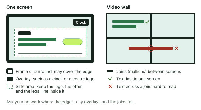
Figure 3. What the safe area keeps clear of: the frame, any overlay and, on a video wall, the joins between screens.
Each Mestra format, whether it’s from a built-in pack or one you’ve added at your screen’s exact size, has a Safe margin and a Bleed. Set them once from the network’s spec, and they become part of the format that every run builds.
7. Legal-line legibility
A legal line that’s technically present but unreadable at screen distance helps nobody, and may not meet what your promotion’s terms require.
- Ask whoever signs off your terms what has to appear on screen, and what can live on a website instead.
- Treat the legal line as text that must be read, with its own minimum size.
- Keep it in the safe area, on a calm background, with enough contrast.
- Check it on every size, not just the master. The smallest format is usually where it fails.
In Mestra, legal text has its own role, so it gets its own minimum type size on each format. A format can also be set to leave the legal line out, such as a tiny placement that points to the full terms elsewhere. That’s your decision per format.
8. Files and final checks
- Export at the exact pixel size in the spec. Don’t rely on the player to scale.
- Use the file types and size limits the network asks for.
- Name files so the network can tell which screen each one is for.
- If you can, check the artwork on the real screen before it goes live.
The short version
- Get the spec for every screen.
- Check contrast against the real environment.
- Set a minimum type size per format, and keep to it.
- Design for the real reading distance and dwell time.
- Use motion sparingly, with no rapid flashing, and check the rules for road-facing screens.
- Keep everything important in the safe area.
- Make the legal line readable, or decide clearly where it lives instead.
- Export exactly to spec.
Sources and notes
- Contrast ratios: WCAG 2.2, success criteria 1.4.3 (Contrast, Minimum) and 1.4.6 (Contrast, Enhanced), from the W3C. They’re written for web content. We use them here as a reasonable floor, not as a DOOH standard.
- Flashing: WCAG 2.2 success criterion 2.3.1 (Three Flashes or Below Threshold).
- Mestra’s format fields (safe margin, bleed, minimum type size, leave out) and how roles work: Masters, formats and runs and Brands.
- Mestra’s flags and review notes: Review and flags.
- What Mestra’s motion does is from Mestra itself, as of 13 October 2026.
- Road-facing digital signs: NSW Department of Planning and Environment, Transport Corridor Outdoor Advertising and Signage Guidelines (November 2017), published at planning.nsw.gov.au. The quotes and dwell times are from its definitions of digital signs and its digital sign criteria.